Simplifying Complex Data Analysis
As lead UX designer I overhauled the filter feature of an internal analytics tool based. I conceptualized and led the development of an enhanced use flow for our users and enabled a robust foundation for upcoming features. I further took ownership of the story cut, readiness of the feature for launch and coordinating with stakeholders before handing over the design to developers for implementation.
Role:
Design lead
Duration:
Dec 2022 – May 2023
Team:
7 developers, 1 business analyst

Overview
Disclaimer
Since I cannot share the original designs or show real data, I created mockups with dummy data that showcase the changes I made to the previous design. Nevertheless, you can still see how the new design and use flow impacted our users’ experience.
This case study entails the redesign concept of the filter feature for a data analytics application. The filter feature enables users to analyze large, complex datasets to quickly find anomalies. Building logical expressions to find results should be easy to read and manipulate even for users without any coding knowledge.
Simplified, you can imagine the following scenario as the basis for a filter expression:
A sales analyst wants to find all of their products, that have been built in the last quarter in Germany with part number xyz.
Objectives
I set myself the following objectives for the redesign:
01 Increase ease of use
Reduce the complexity of creating a filter and enabling users to create filters more efficiently.
02 Scalable and robust interaction concept
Build a solid and flexible framework that allows the seemless integration of future requirements without extensive rebuilding.
03 Guided and human-readable interface
Support users efficiently through the creation of filters by guiding them and using a human-readible display of the filter expression.
Strategic Value
Users often pointed out the filter's limitations and inefficiencies in comparison to the legacy system. The outdated design was neither scalable nor adaptable to new functional requirements and would have made the migration from the old system almost impossible. This redesign not only addressed long-standing user concerns, but also ensured that the feature would be able to adapt to future requirements, ensuring its significance to the overall success of the application.
Outcomes
With the redesign of the filter feature we accomplished the following outcomes:
↑ 35% Space
The filter building area now has 35% more space in the entire screen in comparison to the old design.
+12 Features
More than 12 new features and improvements were included in the redesigned filter feature.
9 Sprints
The complete redesign and launch was done in 9 sprints whereas the old feature was previously developed in 2+ years.
Challenge
We knew that the current filter feature does not meet users' requirements and they reported that working with it is inconvenient. It was also challenging to integrate required functions due to our cumbersome and complex frontend code. Thus I identified the following challenges:
01 Increasing user acceptance
With the current status of the essential filter feature, we are not inspiring confidence in the new application among our users, but rather causing aversion.
02 Technical constraints and limitations
The new interaction concept of the filter should be more intuitive but also needs to consider the given technical constraints (underlying data model and its restrictions from our backend) and rules of set theory.
03 Scalable design concept
The redesign should provide a solid framework for the further integration of functions or user requirements, as major changes to the interaction and design concept are time-consuming and cost-intensive for our client.
Discovery
Since the filter feature is an important (if not the most important feature) of the application, I wanted to start with an in-depth and extensive heuristic evaluation. As a second part of the research I gathered key users' experience and pain points with the current filter.
Heuristic Evaluation
The most severe ratings where for error prevention and helping users to recognize, diagnose and recover from errors as there are almost no patterns implemented that would either prevent users from making errors or sufficiently help them when errors occur.

User Feedback
Along with the heuristic evaluation, I also collected feedback from our users on the current status of the filter. Clustering their feedback into themes showed, that they perceived the current filter interface as clutterend and unclear with too little space for the filter. Another pain point mentioned was no guidance during filter creation and the general inconvenient handling of the filter elements. Also, they are missing features like copy and paste. All in all, the findings from the user interviews correspond with the findings from the previous evaluation.
Click here to view the user research as PDF.
Findings & Strategies
Based on the research, I derived 4 core design principles which built the foundation of the new filter design:
01 Scalable concept
Establish a scalable interaction concept that allows us to seemlessly include new upcoming feature requirements into the filter.
02 Guide users
Support users when building their filters with our application to achieve a smooth transition from the old system and support quick and efficient work with the new filter.
03 Increase filter building area
With a well structured UI we will increase the size of the filter building area to support users in their analytical work.
04 Implement human-readable UI
By having a more human-readable UI we help users transitioning from the old system to our new application.
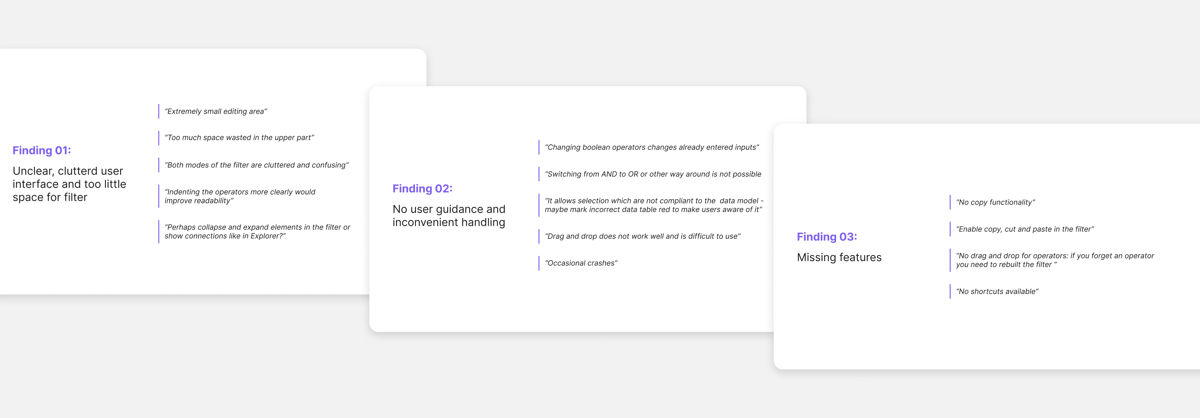
Finding 01: Unclear, cluttered user interface and to little space for filter
The design of the filter elements like the tiles for conditions has several problems.

- 01. The fixed size of tiles
This means that a lot of space is be lost and other elements are be pushed further down and thus out of the visible area. - 02. The tiles allow direct input
However, these do not have inline validation and therefore do not offer the user any guidance during editing. The many UI elements for input also appear too cluttered for larger filter expressions. - 03. It quickly becomes very cluttered
The more tiles, i.e. conditions, users add, the more confusing it becomes for them to understand which conditions are in the operator. - 04. The filter elements do not display the correct logical structure
The structure of the operator does not correspond to the rules of set logic, as the quantifier comes before the Boolean operator but in the old filter design the quantifier is at the end. So it is not only wrong but also appears strangely for the users in terms of reading.
Overall, the area for creating the filter - actually the most important one - is pushed far down the screen by the header and tab area. These elements must be kept as otherwise the entire navigation architecture of the application would need to be restructured and would have pushed the limits of the filter redesign. Thus, there was little leeway to give the filter area more space.

Strategy 01: Restructure and reorganize filter
With the introduced toolbar on the left, we can now place existing sub-functions (filter details like description, filter expression, results table) of the filter in a sustainable and scalable way. New functions in the future can be added with ease and without taking away space from the main area.

To reduce the visual clutter on the user interface, the actual editing of the filter expression is no longer done directly within the filter structure. Editing is made possible via a so-called utility panel, which contains all configuration details (input fields) for operators and conditions. The filter expression itself is read-only but allows adding further elements, moving or collapsing individual nodes.

The redesigned operator and condition nodes now have a minimalistic appearance as they no longer contain input fields. In addition, the filter language is now technically correct and more human-readable.

Due to the restructuring of the UI, the upper area has been reduced from 383 px to 184 px, slightly more than 50%. The area for the filter has been increased from 564 px to 761 px, which is an increase of almost 35%.

Finding 02: No user guidance and inconvenient handling
Both the user interviews and the heuristic evaluation showed that the current filter design did not provide any user guidance, highlighting significant usability issues. The "Help users recognize, diagnose, and recover from errors" heuristic was evaluated with a severity index of 4, indicating a critical area for improvement. Similarly, the heuristic for "Preventing user errors" also scored a severity index of 4, underscoring the need for better proactive error prevention measures. User feedback pointed out that the current filter design allowed inputs that contradicted the data model, failing to prevent users from making avoidable mistakes. Apart from that, the handling of the filter was deemed as inconvenient due to not allowing switching between logical operators, resetting already entered values when changing the boolean operator or ineffective drag and drop.
Strategy 02: Separating input and display
I introduced the so-called utility panel which can be collapsed to give the main builder area more space. It comprises three main functions which can be accessed via tabs. The tab "Configure" includes all configuration details (input fields) for operators and conditions. The input fields now support inline validation guiding users during creating their filter expression. Easy switching of logical and Boolean operators is possible and causes no resetting of values already made. Additional links are also displayed here that direct users to the user documentation in which this exact function is explained in more detail. Via the “Execute” tab, users can see the filter hits listed. Lastly, users can restrict the data set they want to search in with the last tab.

To prevent users from running into errors during execution, the execute button is disabled when there is an error in the filter expression. In addition, users get a warning message explaining why execution is not allowed and how to recover from that state.

To get a better overview and structure, users can now collapse operators. Further, elements are indented, to make it easier for users to see which are connected and how they relate to each other.

Finding 03: User miss features that elevate them in their work
Users mentioned several missing features like copy, paste and cut which the old systems included and helped them in their daily work tremendously. They also generally missed shortcuts, e.g. to quickly add a new operator and thus work faster and more efficiently. The current drag and drop behavior was also criticized. In the current design drag and drop is only available for attributes in one editing mode and is deemed as hard to handle by users. All this is consistent with the severity index 3 for the heuristic "Flexibility and efficiency of use".
Strategy 03: Introducing shortcuts
Due to the filter expression being represented in a tree-like manner, the drag and drop behavior is improved and makes it easier for users to move nodes around. With a drop indicator users are now able to directly see where the dragged element is going to be positioned and also where dropping is not allowed due to the violating the data model.

We introduced functions like copy, paste and cut elements in the filter expression and also implemented them via keyboard shortcuts.

With the improvement of drag & drop, it was no longer necessary to use two different editing modes for the filter expression. With only one mode, we were able to avoid the previous memory usage issues that caused the browser to crash.
Learnings
01 Developing personal leadership skills
Since I was responsible for the whole story map of the redesign, I coordinated with our software architects and developers on how best to proceed with the implementation of the concept due to our technical restrictions and current code base (new filter had to be build in parallel to the old design). Further, I learned how to delegate tasks involved in the implementation of the redesign, e.g. I handed-over in-depth specification of user stories with pure business aspects to our business analysts.
02 Effective communication with stakeholders and team members is a key priority
I got to use new methods (like the MoSCoW method) to prioritize with our customer and key-users which functionalities should be implemented after the basic implementation phase was done. This helped tremendously in aligning my team with our clients and users. I also learned how to effectively communicate with users about our agile implementation approach as they were only familiar with waterfall model in software development.
03 Finding the best 80% version of the complete design vision
The unavoidable truth is that you have finite resources to figure out an infinite amount of problems. So I had to figure out what matters most, then invest my time and effort into the key areas that will help deliver the greatest impact.